
Expertise Thursdays: Evolution of the NBC Logo
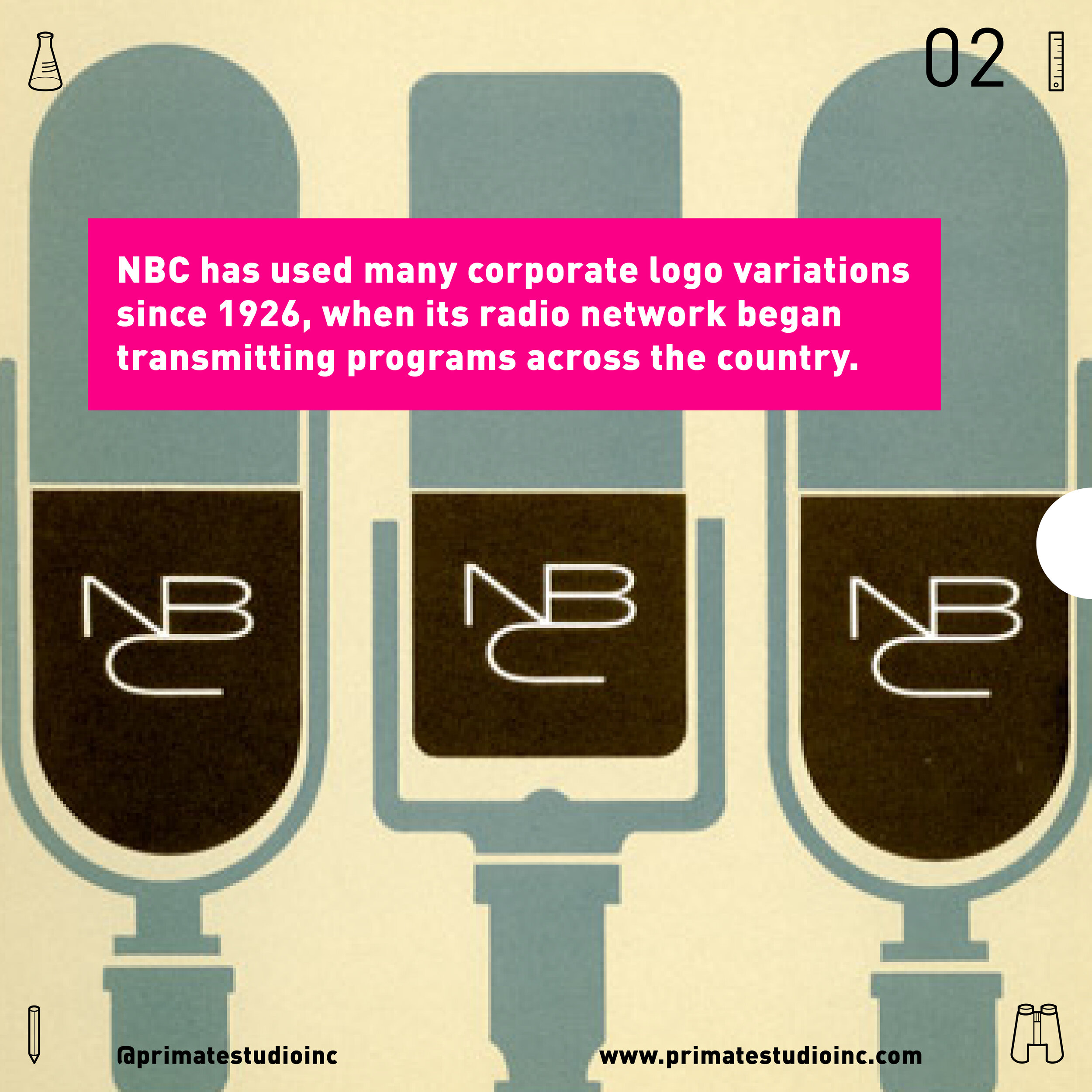

NBC has used many corporate logo variations since 1926, when its radio network began transmitting programs across the country.
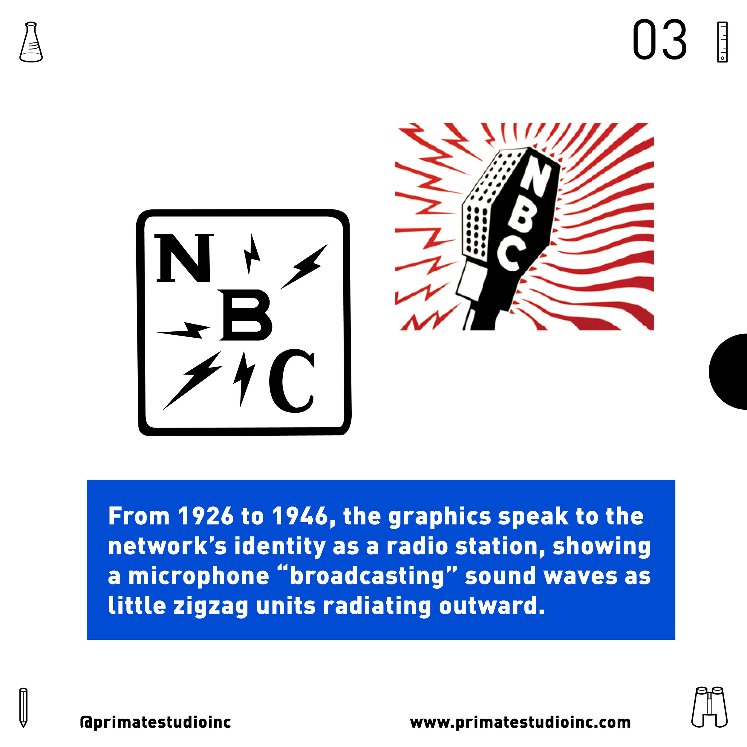
From 1926 to 1946, the graphics speak to the network’s identity as a radio station, showing a microphone “broadcasting” sound waves as little zipzag untis radiating outward.
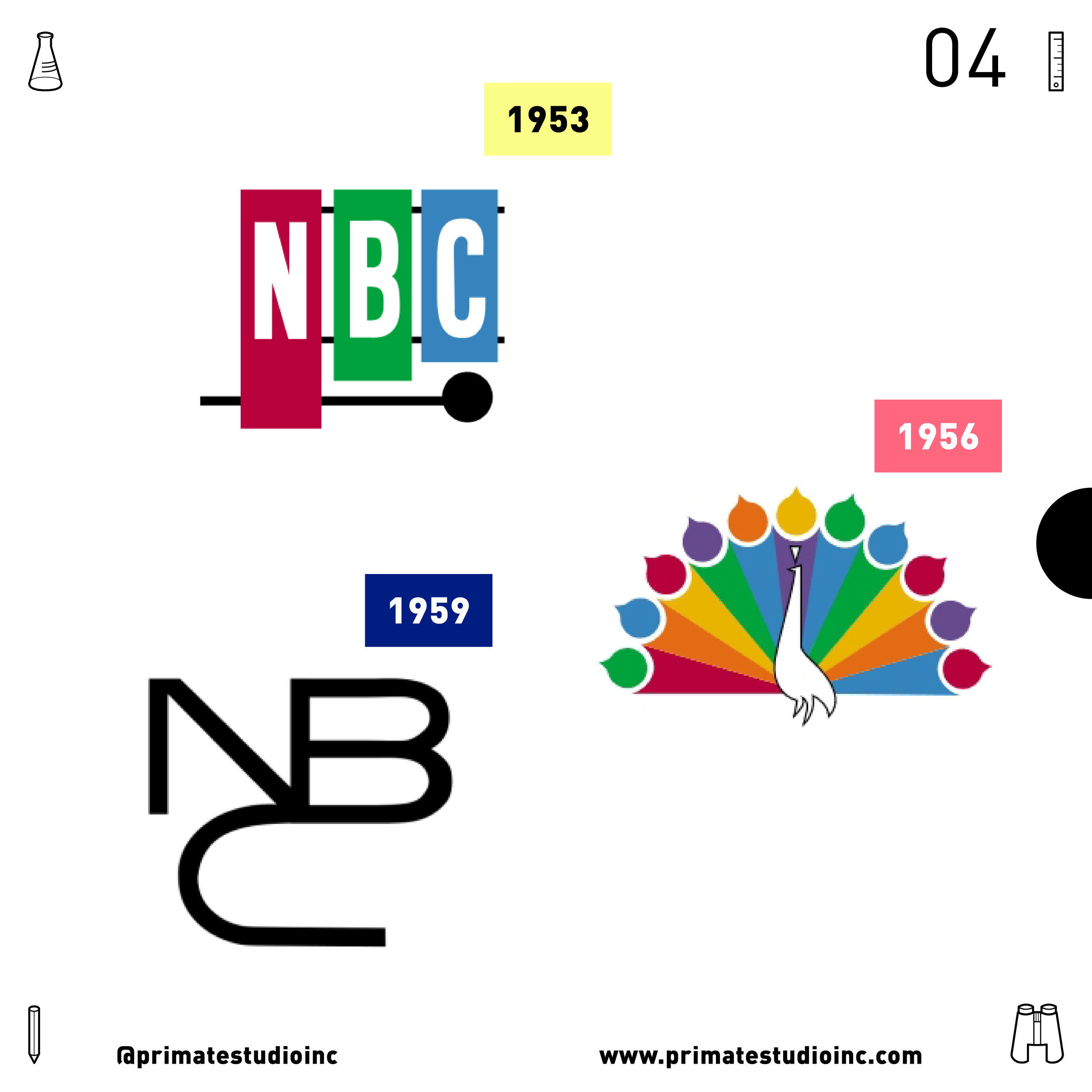
Notable versions include the 1953 NBC keys, the 1954 12 color peacock, and the 1959 snake.
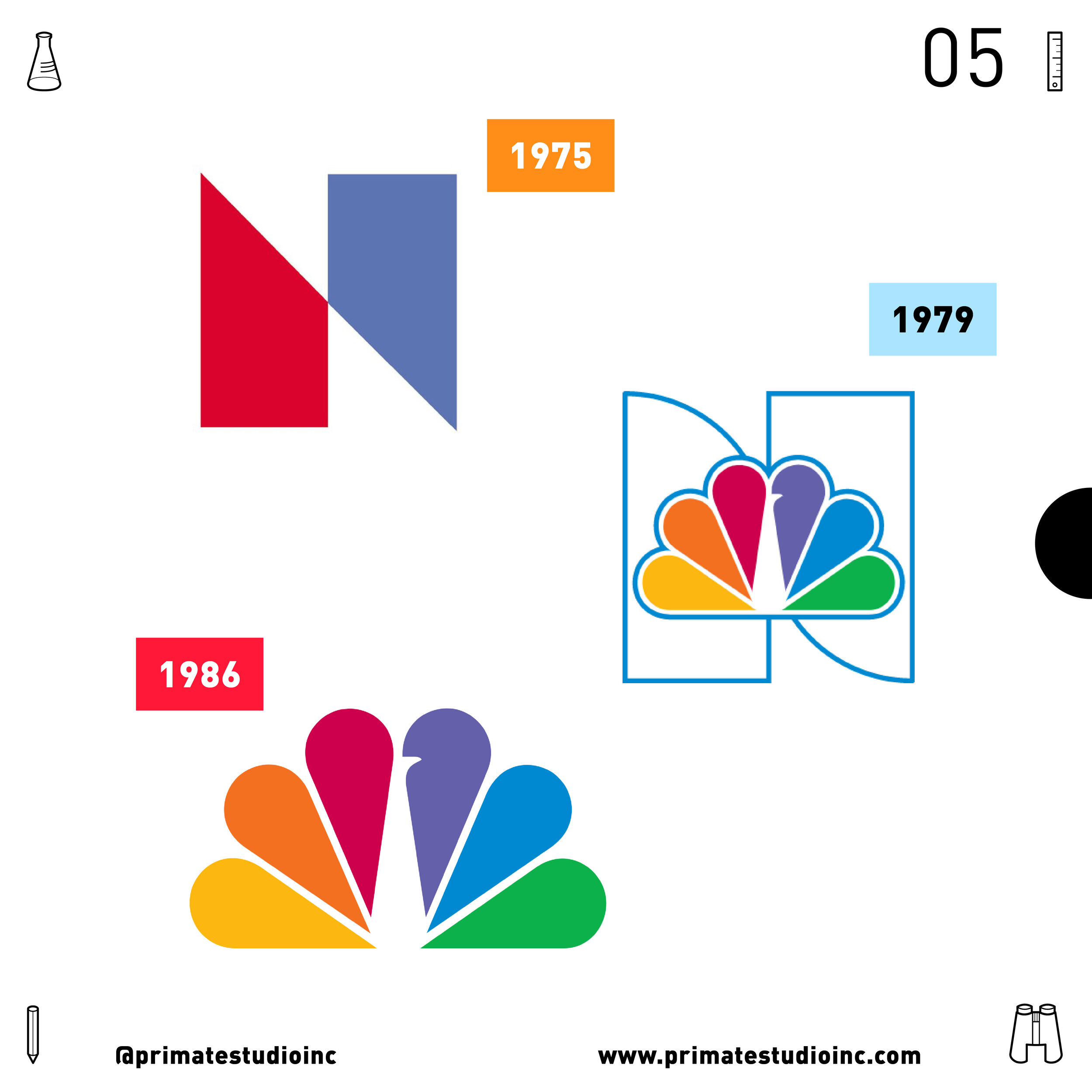
Other notable versions include the 1975 trapezoid N, the 1979 proud trapezoid N with peacock, and the 1986 6 color peacock.
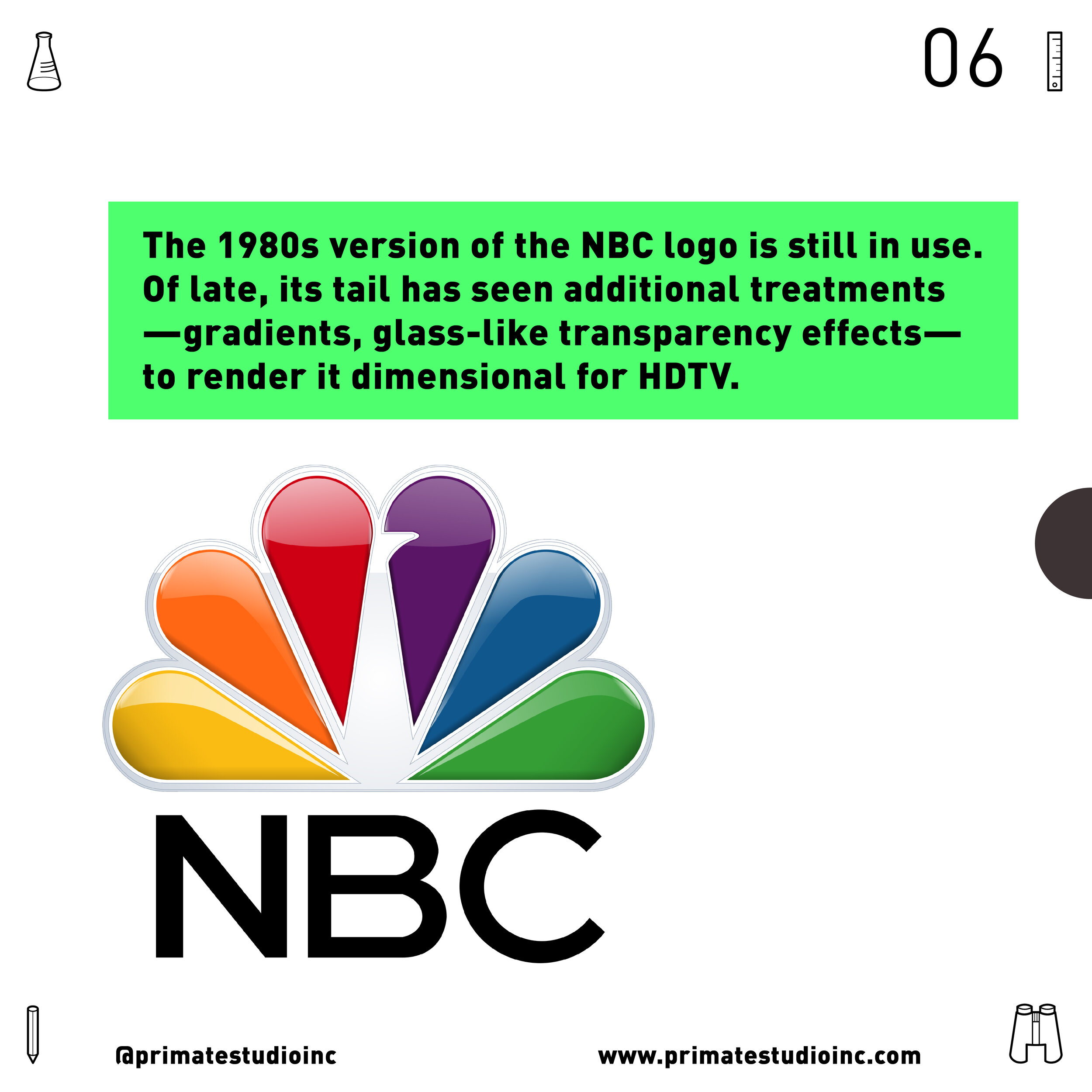
The 1980s version of the NBC logo is still in use. Of late, its tail has seen additional treatments - gradients, glass-like transparency effects- to render it dimensional for HDTV.
2026 Update:
Paul here from Primate Studio, writing to update this article. As mentioned previously, the 1980s logo has been tweaked over the years. This includes most recently, in 2022, the brightening of the colors in the peacock. This is very, very subtle and is related to optimization for our screens while not needing to replace giant dimensional logos on buildings. There have also been very subtle changes to the typography over the years. Keep your eyes peeled as this bird continues to fly!