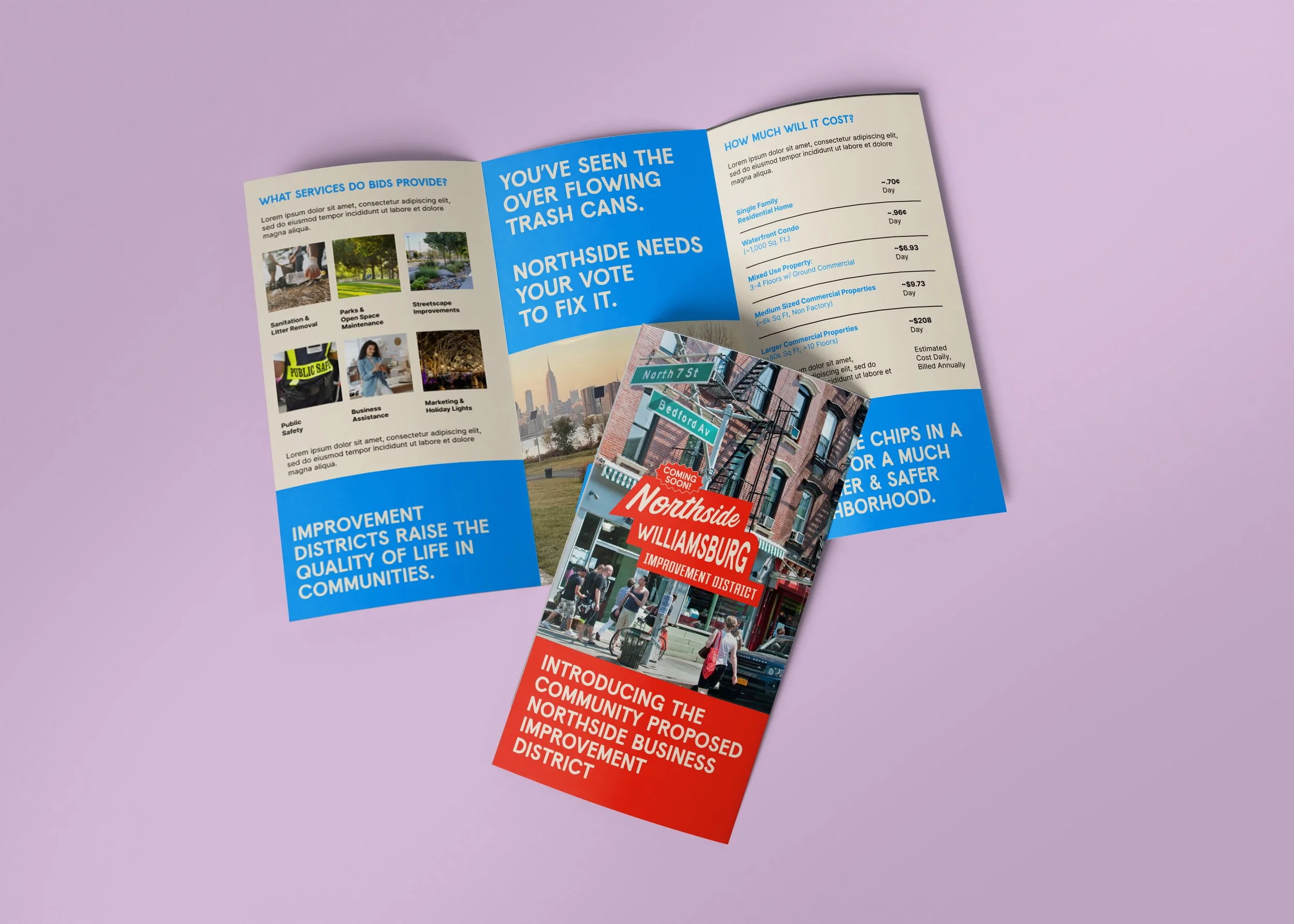
Northside Williamsburg
A new brand identity for the proposed Northside Williamsburg Business Improvement District.
-
This brand works to make sense & bring together an emerging neighborhood identity, one that’s composed of multiplicities:
With both working class, creatives, & professionals
Mixed use: with commercial corridors & diverse residential communities
Featuring varied topography: waterfront, parkland, streetscapes, & open spaces
Home to vibrant cultural spaces & dynamic industrial spaces
& Populated with historic & new construction
-
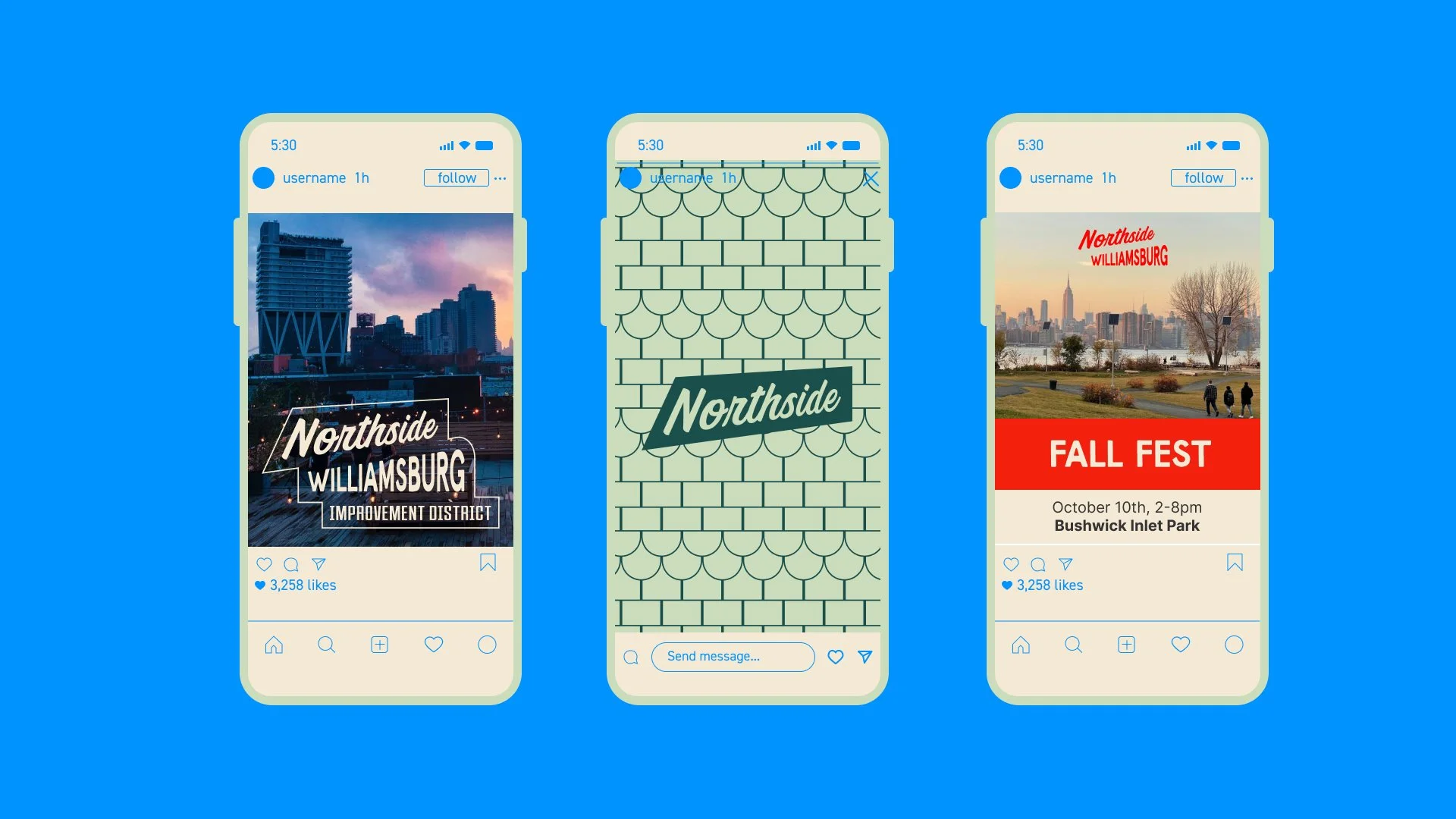
This concept celebrates the eclectic visual identity of Northside Williamsburg, drawing from the neighborhood’s layered history and dynamic present.
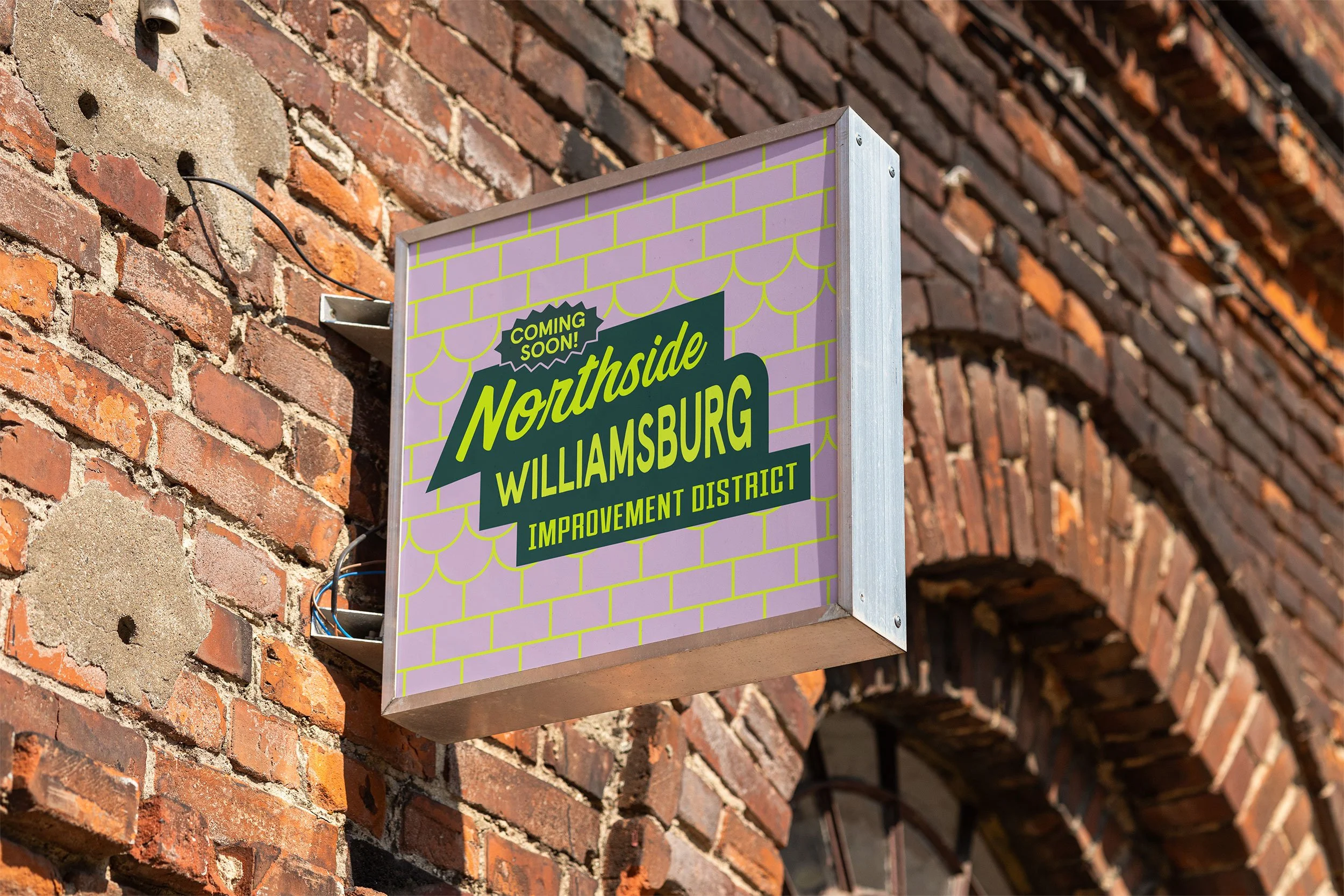
It is inspired by the typography found in classic public and commercial signage, as well as the rich visual language of local murals, storefronts, and building facades—ranging from historic to modern.
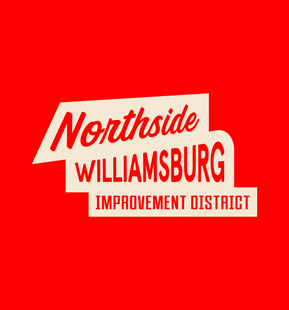
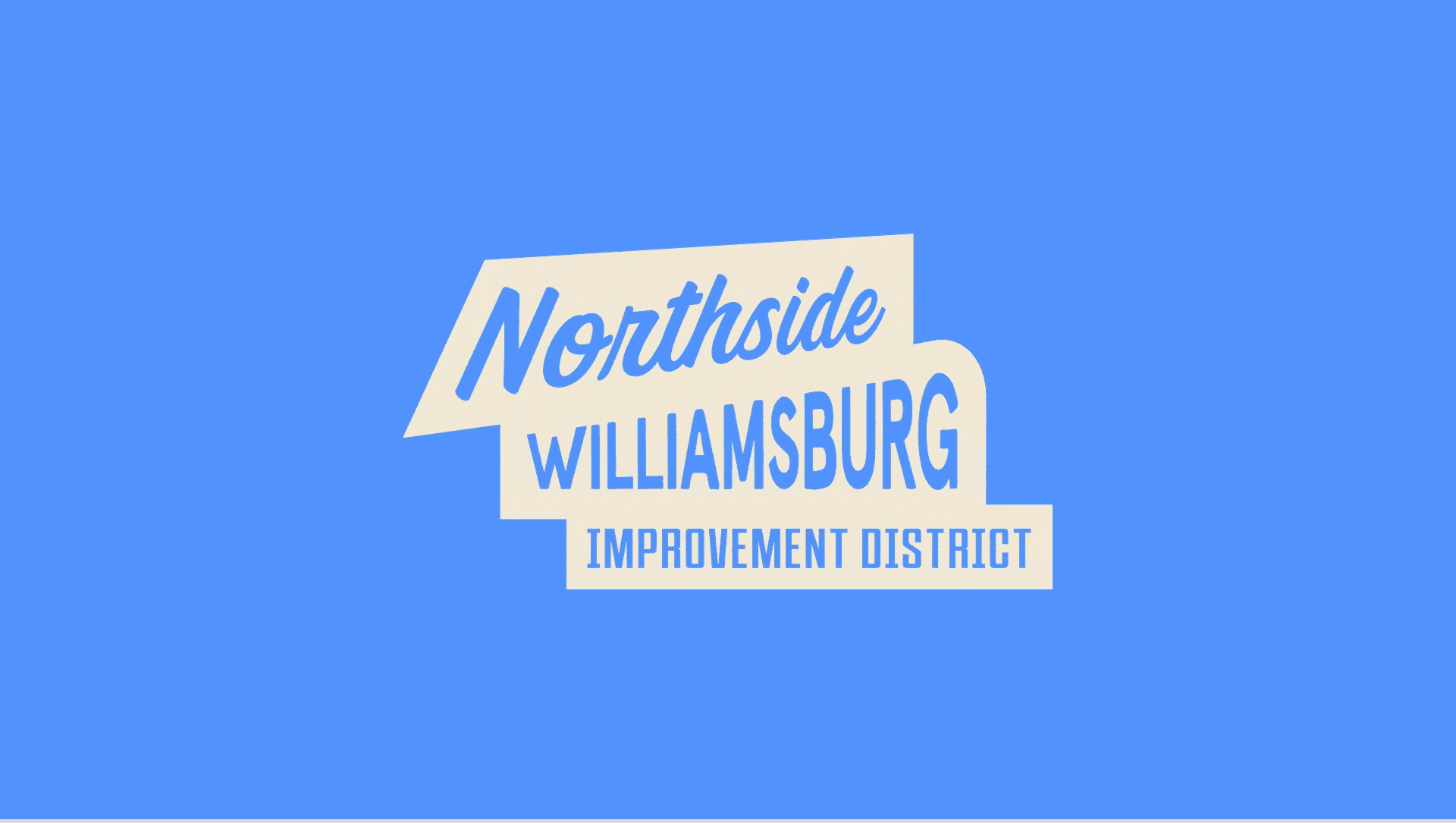
The logo is a composite of diverse typographic styles, arranged at varying angles to echo the visual rhythm of the neighborhood. Elements are unified into a cohesive whole, symbolizing the neighborhood’s unique ability to harmonize contrast.
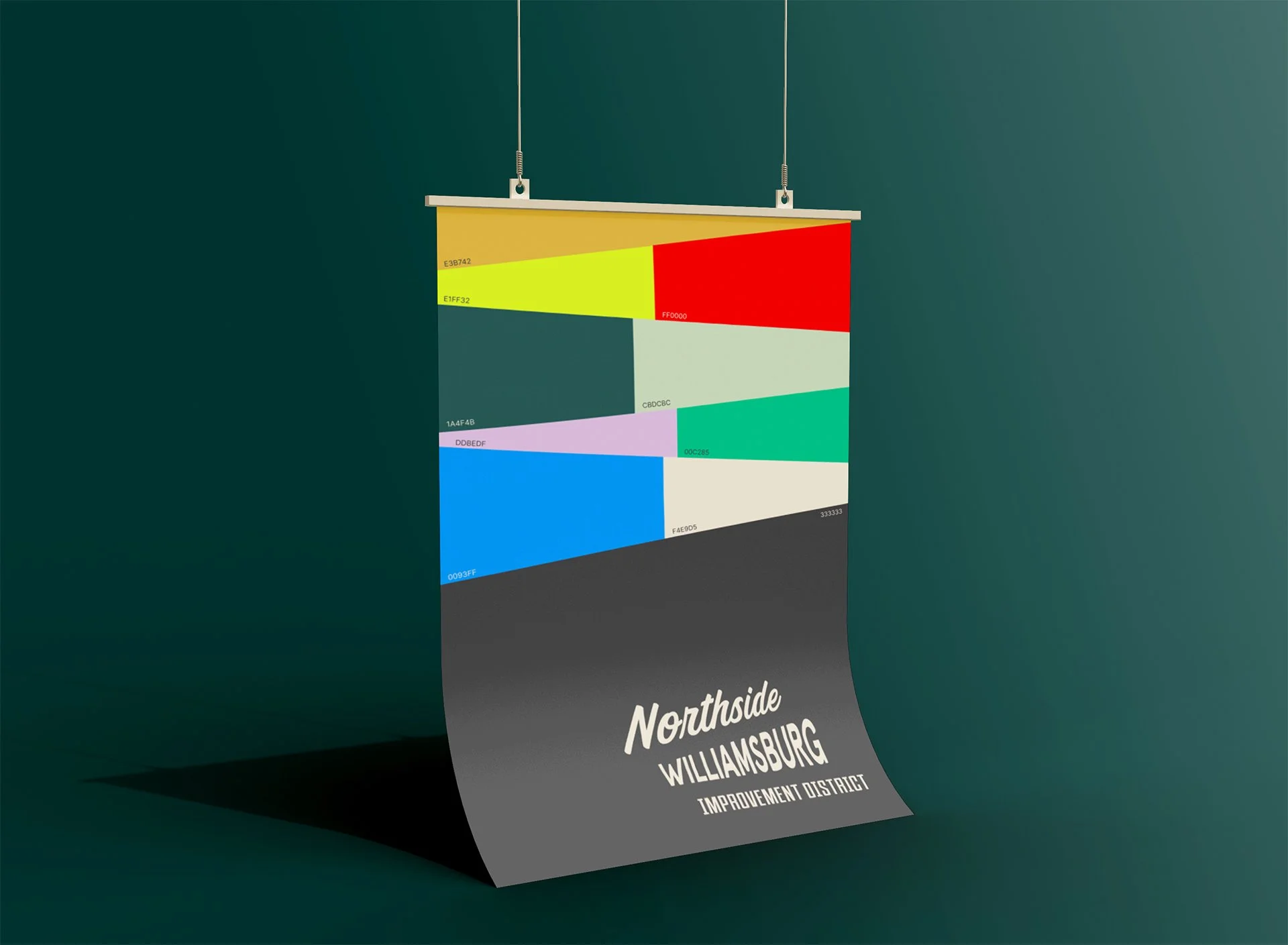
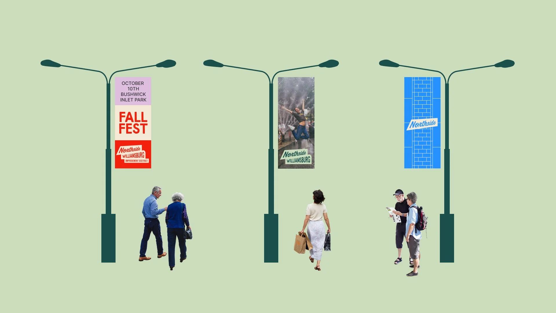
Supporting graphic elements are drawn from the patterns and textures found throughout Northside Williamsburg, from intersecting street grids and architectural surfaces to mural motifs and urban details.
Altogether, this concept embraces aesthetic diversity and dynamic juxtapositions, reflecting the evolving identity of a vibrant, culturally rich neighborhood.
-
Client: Northside Business Improvement District
Project Type: Brand Identity & Strategic Design
Sector: Public & Civic
Year: 2025
Project Timeline: 4 Weeks
Designers: Paul Benson & David Ruperti
Image Formatting: Elle Choo